Fontacular
I am desperate for a new font for use in print work… I used to use Officina Sans wich seemed to be a good all-round kind of font for letters and business cards and fliers and so on but it disappeared off my system and it was just a little boring. So now I want a brand new font and I just don’t know how to find it. I have been browsing font sites until abcdefg1234567 all blur into a fonty smudge. I want it to be cute and quirky, leaning on the retro side (maybe a little like kabel but a bit cooler) but not a display font as it has to still look ok in large-ish bodies of text. I quite like the sans serif font that is used in the Martha Stewart kids mag for captions and intros… if you happen to be font-minded and you can think of something that might suit please either email me or leave a comment.

Oh yes, and the body copy……I mean to mention that the font used for some of the body copy and other headlines in MSK is also made by Emigre, Mrs Eaves:http://www.emigre.com/EF.php?fid=109
Looks great with Base 9 and it’s another gorgeous set (check out the ligatures, too!), sadly I’ve already used it on about 20 book covers in the last 5 years and I had to retire it for a while. 🙂 so useful!
I think instead of spending your money on buying a font, buy some font-making software. You could come up with some way better fonts on your own! 🙂
I quite like Atelier Sans. The lowercase g is great! It’s at ITC, though, the whole font family is US$99!
Damn, it didn’t like my link. Here ’tis:
http://www.itcfonts.com/fonts/detail.asp?sid=R4879V06N64Q9N7NX6NBK29BGLAM98FE&sku=ITC8173
I don’t pretend to know anything about fonts, but I hear this (http://typographi.ca) is a rather good log about typography. It has tons of information and links, anyway.
If you’re willing to use a serif font, Jimbo doesn’t look too shabby at text sizes. Stone Sans isn’t as playful as Kabel, but it’s a decent text font and probably as playful as Officina Sans. I also like Optima, but that may be a little too cool (in the sense of temperature, not hipness).
It’s tough to find a text font that looks playful. Playful tends to be something for display fonts….
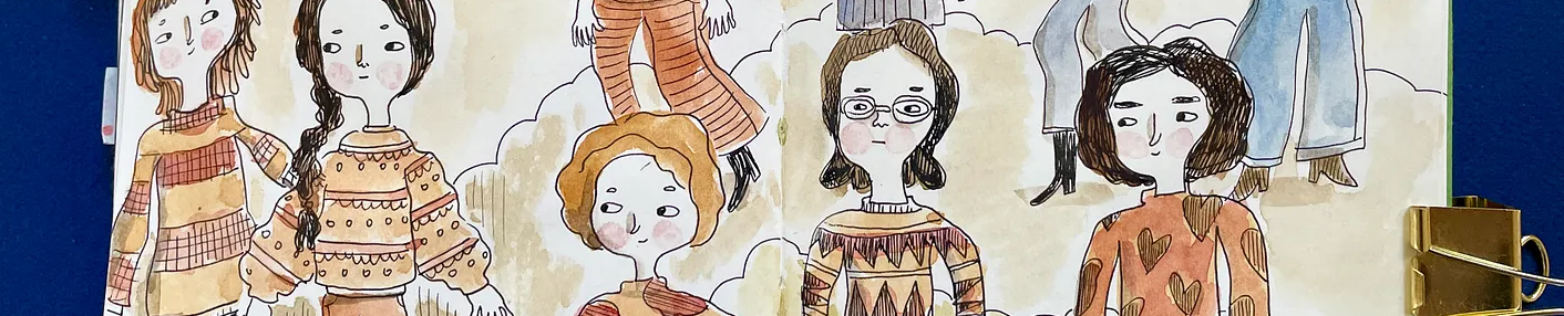
can you scan a page in from the kids mag. i’ve found a cover that seems to have futura on the masthead, and something similar to harmony, meta or bliss along with a serif font. also, certain versions of gill sans are lovely and a bit quirky.
I suggest Frobisher and Nova.
I really quite like Kabel, actually! Another suggestion (and you’ve probably been there already) would be to look at some of the House industry fonts. http://houseind.com/house.php?page=fonts
I personally love universe extended. It’s not tremendously exciting, but i like the big open counters. You might also be able to contact someone at the martha’s kids magazine and ask for the name of the font you like so much. ( The art director or the associate art director). Good luck. I know how supremely frustrating it is when you know exactly what you want, know it’s out there somewhere, but can’t find it!
Hello. me again. Just wanted to tell you that http://www.eyewire.com has a fairly extensive collection to view from allsorts of font houses.
I also go through font boredom! Have you tried Gill Sans, Trebuchet MS or Futura? All three are simple, but fun. I also like Tekton Plus. It’s a little funkier.
okay, last comment I promise! After doing a little search, I’ve discovered that it probaly won’t be easy to go out and purchase the Martha fonts you’re looking for. Seems they’ve been very specifically designed for the magazine. Now I feel all naive and goofy! live and learn. I did find an article on the MSL re-design that I thought might interest you. You can find it here: http://foliomag.com/ar/marketing_redesign_kitchen_martha/
Now I’ll make good on my promise and not pester you again. Today, anyway!
Not sure if this was already mentioned on here (guess I could scroll up and read, but I’m too lazy).
http://www.myfonts.com/WhatTheFont/
That’s a link to myfonts.com’s “What The Font” feature. Supposedly, you can upload a scanned image of the font you’re looking for amd they’ll show you the closest matches in their database.
I’ve never tried it, but this might be your ticket to finding that perfect font.
Cheers!
you should check Jigsaw: a clean, geometric but very playful sans-serif from http://www.typotheque.com (my favourite site now)
Jigsaw is here. Check the Stencil version too.
alright the link again:http://www.typotheque.com/fonts/jigsaw_text_light.html
You need FF Info.
Ragnarok press has tons of groovy fonts, though my tastes are a little more on the gothic-medieval-classical types of things, but it might be worth a peek.http://www.ragnarokpress.com/scriptorium/
I was just signing in to suggest that you check out MyFont.com’s font category listings, which are very helpful, and their WhatTheFont utility, which is incredibly useful… but it would appear that ANJ beat me to it… as for specific fonts, Jimbo MM is very versatile, as mentioned above. Also, using MyFont.com’s “More Fonts Like This” feature applied to Officina Sans, you get a nice listing of similar fonts: http://www.myfonts.com/fonts/linotype/itc-officina-sans/morelikethis.html
Finally, there’s a delightful, quirky, serif font from the geniuses at P22 called Garamouche. Very fun, and it may be just up your alley: http://www.p22.com/products/garamouche.html
Claire, the font they use in MSK for the intros is Emigre’s Base 9:http://www.emigre.com/EF.php?fid=79
It’s a great font pack if you order 9 & 12 together – bolds, italics, smallcaps, and an extended alphabet and extra characters. Emigre fonts are really high quality, and worth the cost.
I used Base 9 in my ferret’s web site (see link in my name) — look at the menu headers.
I recently fell in love with a font called Neutraface by House Industries. I think it’s just lovely.
http://houseind.com/house.php?kit=NEUTRAFACE-FO&sub=view
Kabel is somewhat similar, but I like Neutraface much better.
I think instead of spending your money on buying a font, buy some font-making software. You could come up with some way better fonts on your own! 🙂
Font design can look deceptively simple, but it isn’t. Many people can design standalone letters or standalone words. Whole fonts, however, force you to take into account all possible combinations of adjacent glyphs. Font design software also costs $550 and up if you get the good kind.
For rather unique designs that might harmonize well with the look your illustrations have, definitely consider Kosmik or Critter by Letterror. I must admit I’m somewhat biased, but obviously the designs stand on their own as well.
Those URLs arehttp://letterror.com/foundry/critter/index.html
http://letterror.com/foundry/kosmik/index.html
I tried to put them in as anchors, but your comment poster strips out URLs. Good luck.
BTW the first paragraph in my first post was supposed to be in italics, cos I was quoting another poster, but the comment engine ripped out those tags as well.
Oy.
Try Cronos Pro from Adobe… I think its definitely what youre after!
I personally am pretty nuts aboy Sassoon: http://www.myfonts.com/fonts/agfa/sassoon/
Whoops, sorry about the typo–trying to type and nurse at the same time ain’t easy!